Typographic classification: the geometry of tone

Fredy Polania
Product Strategy • Visual Communication • Web Development
The Technique of Intentional Selection
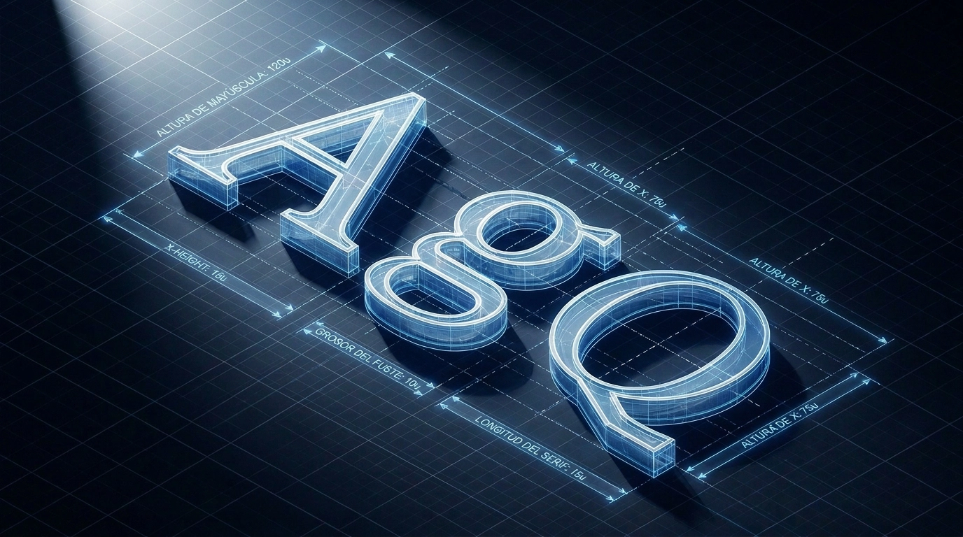
Typography is defined as the art and technique of selecting font families, sizes, lengths, and line spacings. It is not a decorative choice; it is a critical decision of information architecture and brand strategy.
Throughout my career leading product strategy at Novanet Studio, I have frequently encountered a recurring conflict (the translation gap): clients often view typography as a cosmetic detail, while new designers select typefaces based on raw intuition or current trends. In professional branding, however, typography is the visual geometry of your brand’s voice. A mismatch here is not just a visual flaw; it is an operational failure that dilutes brand authority, confuses the user, and ultimately hurts business conversions (ROI).
To bridge this gap, we must understand that letterforms carry historical and structural DNA that governs both their psychological impact and their technical behavior across print and digital screens. Below is the fundamental typographic classification, designed to help clients and emerging designers transform type from simple decoration into a strategic asset.
1. The Vox-ATypI System: Categories of Authority
Created by Maximilien Vox in 1952, this system classifies typefaces into logical categories. It was adopted in 1962 by the Association Typographique Internationale (ATypI) and in 1967 as a British Standard for type classification. This systematic framework is not merely an academic exercise; it is the blueprint that allows designers to propose options with technical authority and enables clients to comprehend the underlying logic of their brand identity.
Maximilien Vox was a French writer, illustrator, publisher, journalist, art critic, and historian of typography. His system brought order to a fragmented landscape of type designs. Today, this structure helps us establish robust design systems and define a digital product’s visual tokens right from its conceptual roots.
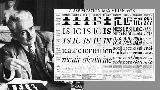 Maximilien Vox (left) and his typographic classification chart (right). Sources 1 2
2. Venetians (1400-1500)
Also known as humanist serif or Renaissance Antiqua.
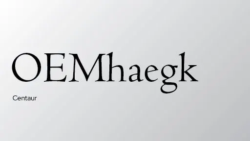 Centaur typeface specimen
Venetian typefaces have a direct relationship with broad-nib pen manuscripts. The axes are highly oblique, contrast is low, and the other stroke characteristics show the modeling of a thick-nib pen.
Strategic Application in Branding: Their direct connection to the human hand makes them ideal for brands seeking to project heritage, craftsmanship, warmth, and organic history. For new designers, selecting this style for a logo communicates organic authenticity. For potential clients, it is the perfect visual choice if their business value relies on human touch and tradition.
3. Garaldes (1600)
Also known as Aldine, old-style Roman, or old style.
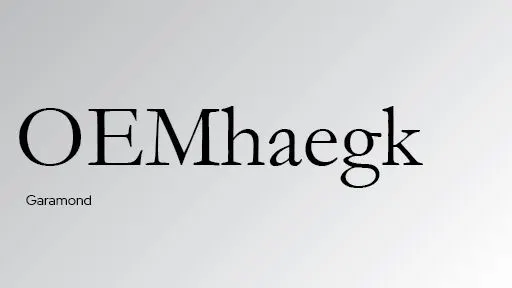 Garamond typeface specimen
In this category, the fundamental calligraphic traits are softened by the influences of the Mannerist and Baroque movements. Garalde typefaces feature fluid forms, medium-to-strong contrast, and variable character widths.
Strategic Application in Branding: The hallmark of classic elegance and literary authority. In logos and corporate identities, they project seriousness, academic prestige, and institutional trust. Ideal for law firms, premium publishers, or corporate entities that rely heavily on long-term credibility.
4. Transitional (1700)
Also known as neoclassical or rationalist.
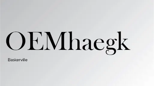 Baskerville typeface specimen
Transitional typefaces were influenced by rationalist philosophy and Neoclassicism—movements visually characterized by vertical axes, systematic construction, and high stroke contrast.
Strategic Application in Branding: Acting as a bridge between calligraphic tradition and modern rationalism, these typefaces project stability, controlled transition, and clarity. They are excellent for financial institutions, established brands undergoing digital modernization, or any project requiring a balance between past reliability and future vision.
5. Didones (1700-1800)
Also known as modern Roman or modern.
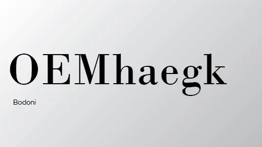 Bodoni typeface specimen
The name Didone is a combination of the two most representative families in this category: Didot and Bodoni. This group of typefaces reflects the expressive ideals of Romanticism by exaggerating the key features of the transitional style: characters feature vertical stress, uniform widths, and high contrast between thick and thin strokes.
Strategic Application in Branding: Their extreme contrast and vertical modulation evoke luxury, sophistication, and haute couture. When designing a logo for premium fashion, cosmetics, or exclusive services, Didones are the ultimate tool for projecting prestige. However, they require careful technical execution: their hairline strokes can easily break down on low-resolution digital screens or small sizes—a classic friction point between design and development.
6. Slab Serif (Mechanistic)
Also known as square serif or mecanistas.
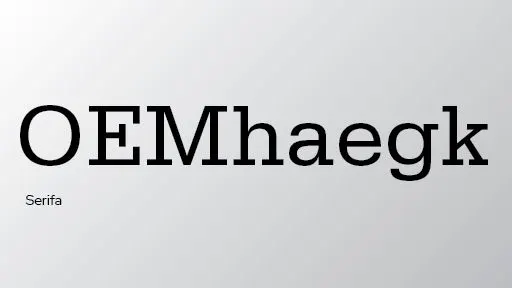 Serifa typeface specimen
Slab serif typefaces developed out of commercial needs. Before the 19th century, type design was oriented exclusively toward book production. The Industrial Revolution dramatically expanded the scope of typography; printers required larger, bolder, and more eye-catching typefaces for advertising and headlines.
Strategic Application in Branding: Robust and direct, slab serifs project industrial strength, reliability, and physical presence. They are perfect for manufacturing, construction, technology, or bold headlines that need immediate attention. In logo design, they bring a heavy, unquestionable authority.
7. Sans Serif
Also known as lineal, gothic, or grotesque.
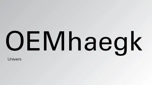 Univers typeface specimen
Sans serif typefaces include a wide variety of sub-classes: grotesque, neo-grotesque, geometric, and humanist sans. The first designs in this category appeared in the early 19th century and were labeled “grotesque” because their stark appearance shocked the design conventions of the time, leading them to be initially marginalized due to the popularity of bold Didone faces.
Strategic Application in Branding: Synonymous with efficiency, neutrality, and digital modernity. They are crucial for tech startups, mobile apps, and interactive products that prioritize screen readability, multi-device scalability, and minimalist clean layouts. They represent the removal of the superfluous to prioritize content.
8. Modern and Contemporary (1900-Today)
Includes glyphic, calligraphic, decorative, and experimental types.
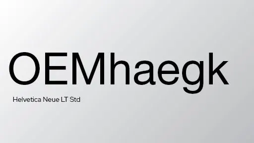 Helvetica typeface specimen
The advent of Modernism in the 1920s triggered the widespread adoption of the sans-serif typefaces that had been rejected a century earlier. Proponents preferred them for their rectilinear simplicity and their alignment with the machine age.
Strategic Application in Branding: By breaking traditional structures, these typefaces (calligraphic, decorative, or experimental) allow for maximum visual differentiation. They are ideal for bespoke logotypes and disruptive brand marks where the goal is not readability, but absolute memorability and visual alchemy.
Bibliography: Designing Type by Karen Cheng
9. Conclusion: Strategic Brand Architecture
Each typographic family carries a unique geometric and historical weight that shapes how your message is received. Selecting a typeface for a logo or a product is not a matter of subjective preference; it is a strategic decision that directly affects your brand’s authority and market positioning.
- For Clients: Do not settle for someone who simply picks fonts that “look nice.” Demand a partner who understands how the geometry of a typeface aligns with your business goals and ensures seamless readability across your digital products.
- For New Designers: Move away from operating as a passive selector of trendy fonts. Master the history, anatomy, and structure of typography so you can defend your design choices with objective, strategic arguments.
- Our Own Brand Alchemy: On this platform, for instance, we combine the editorial serif Fraunces (projecting editorial authority and the Ruler archetype) with Geist Sans (delivering technical precision and the Magician archetype). Two distinct eras and geometries united for one strategic purpose.
If you are ready to build a high-performance visual identity backed by systematic design decisions, let’s connect and define the typographic tone your business requires.