The logo variants: strategic adaptability

Fredy Polania
Product Strategy • Visual Communication • Web Development
The Visual Identity as a Liquid System
In the digital age, a static logo is a limited asset. As a founder, I see the logo variants as the liquid infrastructure of the brand, allowing the identity to be coherent on any medium, from a 16px favicon to a billboard.
1. Logo vs. Logotype: The Order of Reason
The origin of the word logos comes from Greek and means reason or plan. In ancient Greek philosophy and early Christian theology, it refers to the divine reason implicit in the cosmos, ordering it and giving it form and meaning.
In graphic design, “logo” is commonly used to refer to the visual identifier or logotype. It is defined as the visual system that identifies a commercial activity. Since each company has a series of unique features, the importance of a logo becomes evident. Knowing the possible variants for our identity design allows us to clearly communicate its core values.
Long before graphic design became a formalized academic profession, humans developed visual languages to relate shapes and figures to represent ideas, events, or actions. With the academic formalization of design, conventions were established for logo classification. The following are the most common variants:
2. The Core Variants of Visual Identity
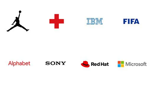
Emblems (Isotypes)
Also called identification symbols, these are marks without typography that have a simple, direct, and immediate visual impact:
 Nike Air and Red Cross emblems
Monograms
Composed of the initials of the company’s name when it is too long to use in full. The typography is treated structurally to acquire qualities of expression close to a symbol:
 Logos of International Business Machines (IBM) and the Fédération Internationale de Football Association (FIFA)
Logotypes (Wordmarks)
This variant is formed exclusively by the name of the commercial activity. Wordmarks or logotypes refer to design built solely from typography, rather than a combined symbol:
 Logotypes of Alphabet and Sony
Combination Marks (Imagotypes)
As the name suggests, these are combinations of emblems, logotypes, or monograms. Since it is a composition with more than one element, they generate a stronger visual impact and offer greater operational versatility.
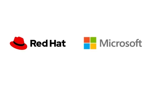 Combination marks of Red Hat and Microsoft
3. Selecting the Right Variant: A Strategic Decision
The choice of visual identity is not governed by rigid rules. A key factor that guides this decision is the length and nature of the brand name:
- Names with two or more words: A monogram is a strong alternative. Acronyms are often easier to recall than long, complex names.
- Short names (one or two words): A logotype (wordmark) can represent the brand with high typographic efficiency.
- Global or scalable brands: A combination mark (imagotype) provides maximum adaptability, allowing the emblem and the wordmark to be used together or separately across different design touchpoints.
Regardless of the path chosen, the company name plays a fundamental role in determining which variant is best suited to project the company’s values with absolute clarity.
4. Conclusion: Coherence in the Liquid System
Having variants is not an aesthetic whim; it is an operational necessity. Each medium—from a 16px favicon to a billboard or mobile app icon—requires a distinct configuration. Designing with these variants in mind from the beginning is what allows a brand to scale without its image being degraded.